Skip to content

Imprint Magazine

  • Home
  • Blog
  • About Us

Tony

What Is a Print Run? How Publishers Think About Quantity
October 6, 2026 by Tony
Duotone orange and navy illustration of stacks of printed booklets or books, with one upright blank volume standing on a central stack.

A print run records how many physical copies are produced in one printing event. Here is how that quantity affects inventory, availability, production, and publishing risk.

Categories Publishing

Serif vs Sans Serif for Long-Form Print Reading

September 23, 2026 by Tony
Duotone editorial illustration of an open book under a desk lamp, with contrasting text-like line styles on each page, surrounded by papers and a coffee mug.

Serifs do not automatically make printed text easier to read. Compare typefaces as complete page systems, then proof the design at final size on the intended paper.
Categories Typography

Why Print Magazines Still Matter in a Screen-First World

September 21, 2026 by Tony
Duotone orange and navy illustration of an open magazine, with a coastal landscape and seated figure on one page and a woman’s profile on the other, surrounded by upright magazine-like panels.

Print magazines remain valuable because the issue itself can carry meaning. Paper, typography, page order, image reproduction, and binding create a finite editorial experience that a feed cannot duplicate.
Categories Magazines & Zines

What Makes a Publication a Periodical?

September 18, 2026 by Tony
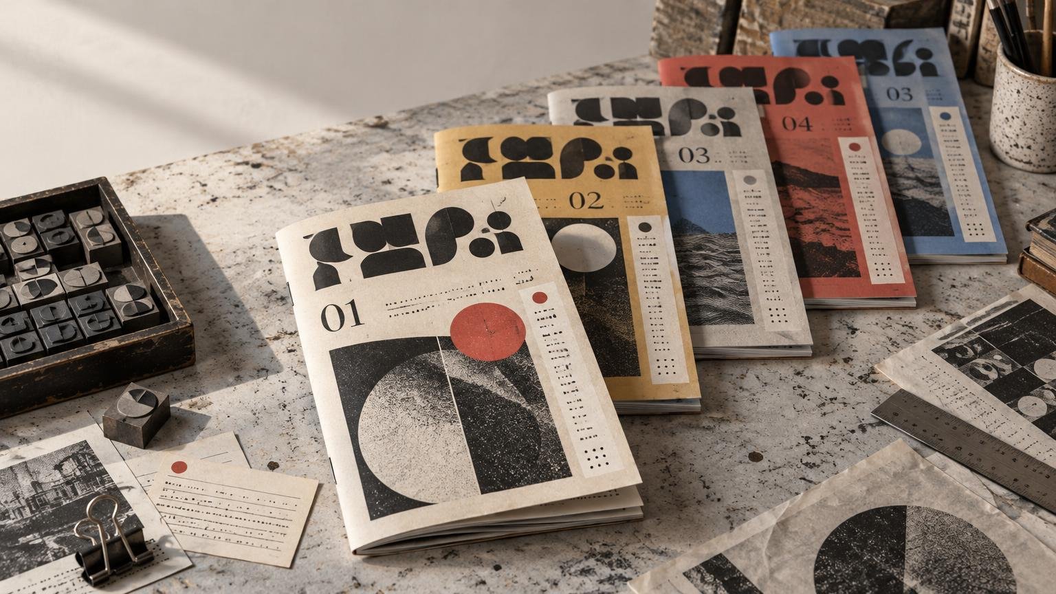
A sunlit print-studio table holds five numbered, abstract-design periodical issues, surrounded by metal type blocks, paper samples, a ruler, and archival printing tools.

A periodical is an ongoing publication released as separate, identifiable issues. Here is how recurrence, numbering, editorial structure, and design define the form.
Categories Publishing

Aesthetic Transparent Sticker Collections — A Print Design Perspective

September 16, 2026 by Tony
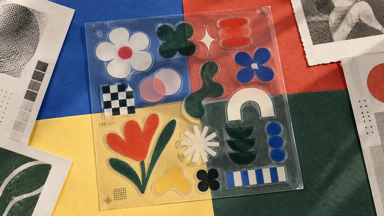
Overhead editorial still life of a transparent sticker sheet with colorful floral, geometric, checkerboard, stripe, and abstract decals arranged on blue, red, yellow, and dark green paper alongside halftone print samples.

Learn how clear film, white underprinting, typography, negative space, surface color, and sheet composition shape a cohesive transparent sticker collection.
Categories Graphic Design

Reverse Type in Print: When White Text on Color Works

September 12, 2026 by Tony
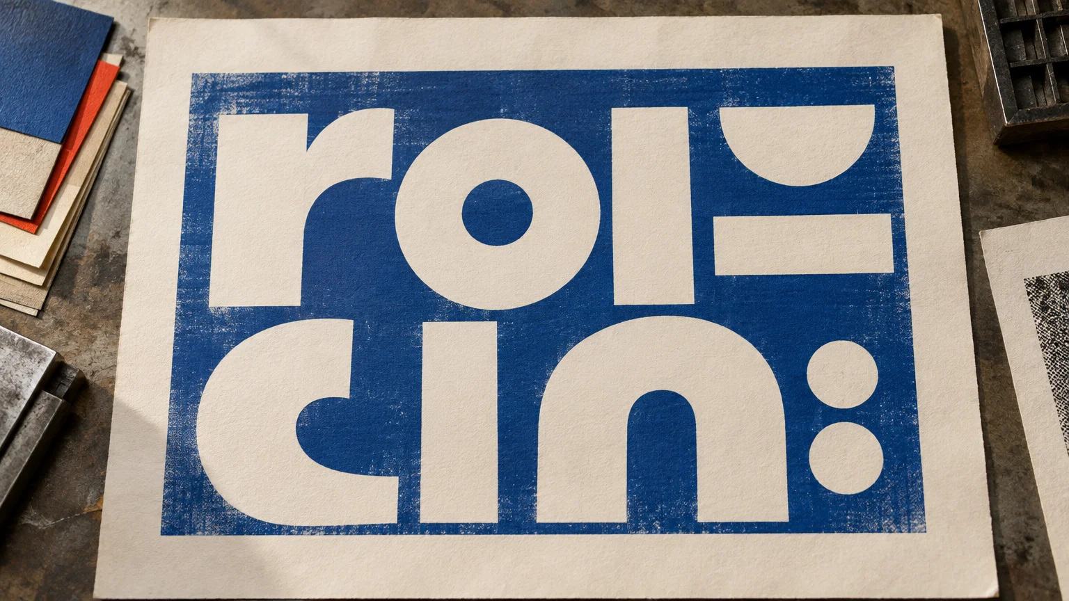
Overhead view of a textured cream print sheet with oversized off-white geometric letters reversed out of a distressed deep-blue rectangular ink field, surrounded by stacked colored paper and printing materials on a worktable.

Reverse type creates instant hierarchy by letting light letterforms emerge from a printed field. Learn when it works, what makes it fail, and how to prepare it for press.
Categories Graphic Design

ISBN vs ISSN: Books, Magazines, Journals, and Serial Publications

September 11, 2026 by Tony
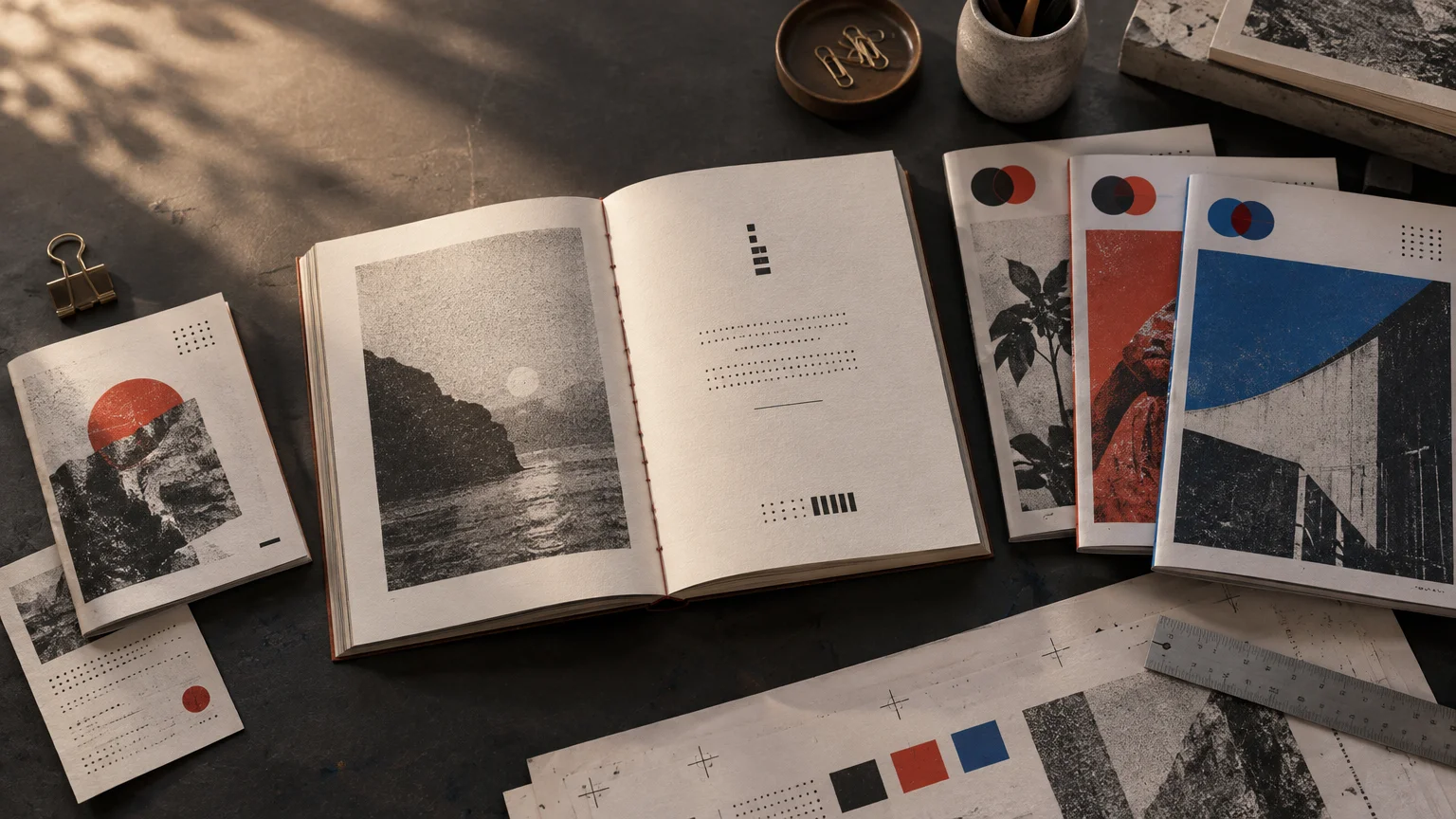
Overhead view of an open art book and several abstract print publications on a dark studio table, with halftone images, red and blue geometric accents, loose paper, a ruler, binder clip, paper clips, and a coffee cup.

ISBNs identify specific books and other finite monographic publications, while ISSNs identify continuing titles such as magazines, journals, and newspapers. Here is how to choose between them—and when a publication may use both.

Categories Publishing

Recent Posts

  • What Is a Print Run? How Publishers Think About Quantity
  • Serif vs Sans Serif for Long-Form Print Reading
  • Why Print Magazines Still Matter in a Screen-First World
  • What Makes a Publication a Periodical?
  • Aesthetic Transparent Sticker Collections — A Print Design Perspective

Tags

adult nostalgia custom labels custom sticker printing custom wine labels at home design culture desk breaks homemade wine labels low cost lunch games pocket hobby printable wine labels proxy cards unique scooter sticker designs waterproof labels wine bottle labels wine label templates
© 2026 Imprint Magazine • Built with GeneratePress