Skip to content

Imprint Magazine

  • Home
  • Blog
  • About Us

Typography

Serif vs Sans Serif for Long-Form Print Reading
September 23, 2026 by Tony
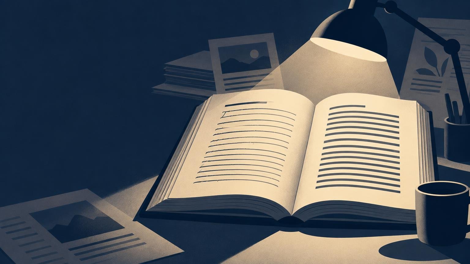
Duotone editorial illustration of an open book under a desk lamp, with contrasting text-like line styles on each page, surrounded by papers and a coffee mug.

Serifs do not automatically make printed text easier to read. Compare typefaces as complete page systems, then proof the design at final size on the intended paper.

Categories Typography

Recent Posts

  • Serif vs Sans Serif for Long-Form Print Reading
  • Why Print Magazines Still Matter in a Screen-First World
  • What Makes a Publication a Periodical?
  • Aesthetic Transparent Sticker Collections — A Print Design Perspective
  • Understanding Newspaper Format and Beyond: A Guide to Writing Styles

Tags

adult nostalgia custom labels custom sticker printing custom wine labels at home design culture desk breaks homemade wine labels low cost lunch games pocket hobby printable wine labels proxy cards unique scooter sticker designs waterproof labels wine bottle labels wine label templates
© 2026 Imprint Magazine • Built with GeneratePress