TLDR
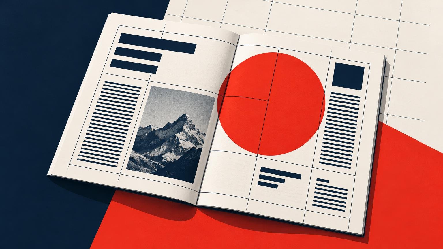
Swiss style editorial design is a method for making relationships among pieces of information visible. A grid establishes recurring alignments; typography separates editorial roles; asymmetry creates emphasis; and images, color, and negative space help route attention. Helvetica is historically relevant, but it is not mandatory. To apply the style well, begin with content and page architecture rather than copying the familiar costume of red, black, white, and sans-serif type.
The most useful way to understand Swiss style editorial design is as an information system. A good page does not merely look clean. It tells readers where to enter, what belongs together, what repeats, and what deserves attention. The structure can accommodate a magazine feature, catalog, book, annual report, or zine without forcing every publication to resemble a mid-century poster.
What Swiss Style means in editorial design
“Swiss Style” and “International Typographic Style” substantially overlap in everyday design language, although their historical meanings are not perfectly interchangeable. Here, Swiss Style refers to the grid-led, typographically disciplined approach developed by Swiss designers and schools and circulated internationally during the mid-20th century. The movement gained broad international recognition in the 1950s and 1960s.
The Swiss National Library’s account of the International Style identifies typographic grids, sans-serif type, precise execution, rational composition, restrained color, and frequent use of black-and-white photography among its defining characteristics for the period from 1950 to 1970. These are historical tendencies, not rules that every Swiss designer followed in every project.
There was meaningful variation within Switzerland. The Swiss Confederation’s design history describes designers associated with Zurich as strongly committed to grids and Helvetica, while Basel designers used grids more selectively and often favored Univers. Both Helvetica and Univers entered the market in 1957. That distinction matters because it prevents a broad movement from collapsing into a single typeface or rigid visual recipe.
How to recognize Swiss Style on an editorial page
Posters provide the movement’s most famous images, but an editorial layout asks different questions. A poster may organize one concentrated message. A magazine or book must coordinate headlines, decks, body text, captions, folios, running heads, images, sidebars, and navigation across many pages.
Look for relationships rather than isolated motifs. Common signals include:
- Repeated vertical and horizontal alignments that connect otherwise separate elements
- Asymmetrical composition held together by consistent proportions
- A limited number of typographic voices, each assigned a clear editorial role
- Hierarchy created through scale, weight, spacing, position, and contrast rather than ornament
- Negative space used to separate levels of information and clarify sequence
- Photography, photomontage, cropping, or geometry employed as information-bearing material
- Restricted color used consistently to identify, distinguish, or emphasize content
None of these signals alone makes a layout Swiss. A page set in Helvetica is not automatically systematic, and a sparse page is not necessarily well organized. The stronger test is whether its visual decisions express the structure of the content.
The grid is editorial infrastructure
A grid is a set of spatial relationships, not a collection of visible boxes. It can define margins, columns, gutters, baseline intervals, image zones, caption positions, and the locations of recurring elements. Readers may never see its lines, but they encounter its consequences whenever a caption sits predictably beside an image or a section opener establishes a recognizable rhythm.
Start by listing the kinds of material the publication must hold. A feature magazine might need body copy, display headlines, standfirsts, pull quotes, captions, credits, folios, and full-bleed images. A catalog may require item numbers, dimensions, dates, descriptions, and cross-references. Build a grid capable of accommodating those roles before composing the most dramatic spread.
A practical grid-building sequence
- Choose the finished page format and establish margins with binding, trimming, and comfortable handling in mind.
- Select a body-text size, leading value, and line length that can sustain extended reading.
- Divide the live area into enough columns to support both text and images. More columns create more placement options, but also more opportunities for inconsistency.
- Establish recurring zones for folios, captions, running heads, notes, and other navigational elements.
- Test the grid on a dense text page, an image-led spread, a contents page, and a section opener.
- Define a small number of legitimate exceptions rather than improvising a new structure on every page.
Asymmetry can coexist with order because balance does not require mirroring. A headline occupying the upper-left portion of a spread might be counterweighted by a photograph lower on the facing page. Their edges, scale, and surrounding space can still derive from the same grid.
Breaking the grid is most effective after repetition has made the system legible. An image crossing several columns, an isolated page number, or a headline displaced into the margin then reads as a deliberate event. If every page breaks the system differently, there is no stable expectation to break.
Typography should describe editorial roles
A Swiss-influenced hierarchy can be built with one type family, but uniformity is not the goal. Headline, deck, body, caption, folio, and navigation must remain distinguishable. Size is only one tool: weight, width, case, spacing, indentation, line length, and placement can all signal function.
Helvetica and Univers are historically significant, not entrance requirements. A contemporary designer can use another sans serif or pair a restrained display face with serif reading text. The better question is whether each typographic change performs an editorial job. For long passages, compare typefaces as complete page systems and proof them at final size; the choice is more nuanced than assuming either category guarantees readability. Our guide to serif versus sans serif for long-form print reading expands on that decision.
A useful type specification might assign one family and weight range to display information, one treatment to continuous reading, and one compact style to captions and metadata. Keep the number of distinctions low enough to learn. If two styles communicate the same role, one may be unnecessary.
Images and color should carry information
Swiss graphic design did not rely on one image language. Josef Müller-Brockmann’s Musica Viva of 1958 demonstrates an abstract geometric approach. MoMA records the large-format work at 128 by 90.5 centimeters and identifies its production as linocut and letterpress by City-Druck in Zurich. Armin Hofmann’s Stadt Theater Basel from 1965 offers a different route: Poster House identifies it as a black-and-white photomontage poster.
For editorial work, ask what the image is doing. A documentary photograph may establish subject and place. A severe crop may direct attention to form or gesture. A sequence of images may explain time or comparison. Geometry can visualize rhythm, category, or proportion. Placement should support that purpose instead of filling a rectangle left empty by the template.
Color works best when its role is repeatable. One accent might identify a department, distinguish annotations, or flag navigation. A second color might separate data from commentary. Restraint makes those signals conspicuous, but restraint does not mean every project must use red, black, and white. A broader palette can still behave systematically when each color has an assigned purpose.
| Element | Systematic question | Possible decision |
|---|---|---|
| Headline | Where should the reader enter? | Large type aligned to a recurring column edge |
| Body text | What supports sustained reading? | Consistent measure, leading, and paragraph treatment |
| Caption | How is an image identified? | Smaller type in a predictable image-adjacent zone |
| Color | What distinction must recur? | One accent assigned to navigation or a content class |
| Exception | Why should this moment interrupt the rhythm? | A grid departure reserved for section openings or key images |
Paper and printing can strengthen or undermine the system
Editorial precision must survive physical production. Fine rules, small type, reversed lettering, close alignments, dark areas, folds, and elements crossing a spread deserve inspection at actual printed size. A clean screen preview cannot reveal every interaction among ink, paper, trimming, binding, and the center of a spread.
Opacity is especially relevant in books and magazines printed on both sides. Paper-opacity testing compares reflected light under specified backing conditions; in practical terms, greater opacity can reduce distracting show-through from material printed on the reverse. This matters when a quiet, pale page backs onto a dark photograph or dense block of type.
Stock labels alone do not settle the choice. Ask the printer for appropriate samples and, where the project warrants it, a representative proof. Test the smallest type, thinnest rule, darkest area, reversed elements, and a pair of facing pages. The practical constraints of reverse type in print are particularly relevant when a restrained layout depends on fine white lettering over color.
Separate the artifact from its reproduction when studying historical work. A 2019 Museum für Gestaltung Zürich Müller-Brockmann reproduction, for example, is documented as a screen print on 170 g/m² coated paper. That production description should not be projected backward onto the original work. Process, stock, scale, and reproduction date all influence what viewers see.
For contemporary production planning, a specialist such as a printing service for publications and other print projects can be a practical next step once the editorial system, format, quantity, and proofing requirements are defined. Before approval, use a disciplined custom print proofing process rather than treating the exported PDF as the final physical result.
Three historical references worth studying
Josef Müller-Brockmann’s Musica Viva
Study the relationship among scale, geometry, sparse typography, and empty space—not merely the surface appearance. The documented linocut and letterpress production is a reminder that apparent precision was achieved through material processes, not born as frictionless vector graphics.
Armin Hofmann’s Stadt Theater Basel
Hofmann’s 1965 photomontage shows that the tradition could accommodate forceful imagery rather than only abstract geometry. Examine how photographic contrast and cropping perform the visual work that another composition might assign to shapes or oversized type.
Emil Ruder’s Typography: A Manual of Design
Originally published in 1967, Ruder’s 274-page manual appeared in German, English, and French. Its publisher describes it in terms of structure, grid, readability, rhythm, and proportion and lists 550 illustrations. It is valuable because its physical pages demonstrate the typographic relationships the text discusses.
How to use Swiss principles without making a period pastiche
Preserve the method and adapt the appearance. A modern editorial project can use flexible modules, serif body copy, digital photography, varied color, and expressive section openings while retaining proportional discipline. What makes the work coherent is not fidelity to 1960s visual cues but consistency between information and form.
Before sending the project to print, audit it with five questions:
- Can a reader identify the first entry point on every important page or spread?
- Do repeated elements align to an actual system rather than approximately matching one another?
- Does every change in type, color, scale, or position communicate a difference in meaning?
- Are grid exceptions rare enough to register as intentional?
- Has the design been checked at final size, on facing pages, and through an appropriate proof?
Make the relationships visible
The durable lesson of Swiss Style is not that every page should be neutral, minimal, or set in Helvetica. It is that editorial relationships can be made visible through alignment, proportion, hierarchy, repetition, and purposeful contrast.
Begin your next layout with a content inventory and one representative spread. Establish the reading measure, columns, recurring zones, and hierarchy before adding stylistic effects. Then test a dense page, an image-led page, and a deliberate exception. If all three feel related while serving different editorial needs, the system is working.
References
- Swiss Style forever – the story of a graphic design tradition
- The International style 1950-1970
- Josef Müller-Brockmann. Musica Viva. 1958 | MoMA
- The Swiss Grid | Poster House
- T 425 om-06 – Opacity of Paper (15/d geometry, Illuminant A/2º, 89% Reflectance Backing and Paper Backing)
- Editionen Museum für Gestaltung Zürich: Josef Müller-Brockmann. Edition I
- Typography. A Manual of Design – Niggli