
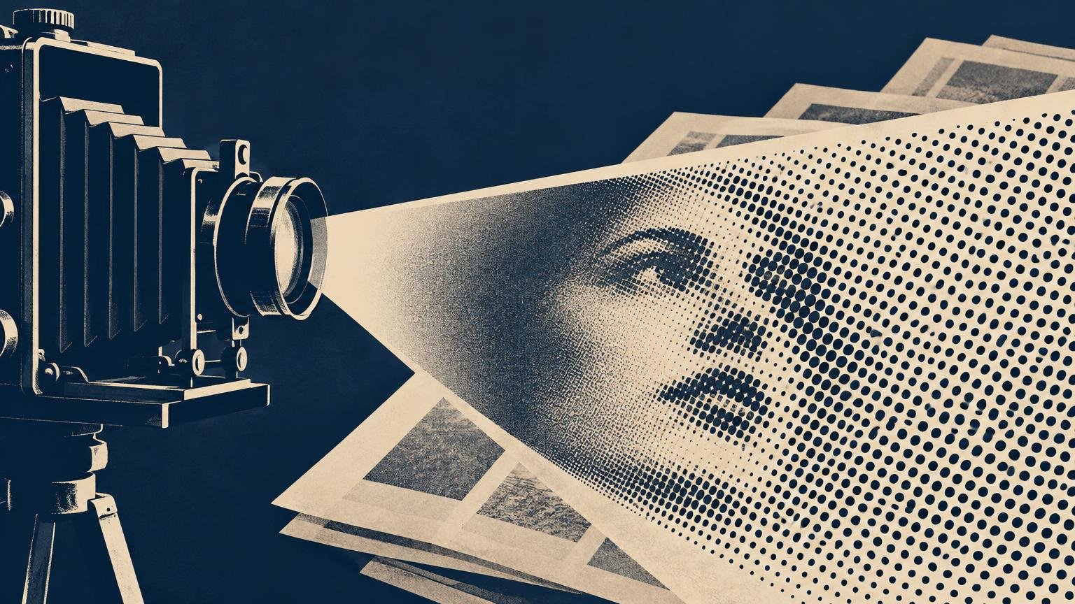
Halftone printing made photographs compatible with the ordinary printed page. Instead of trying to print every continuous shade in a photograph, the process translated light and dark areas into a pattern of discrete marks. Small dots or sparse coverage created highlights; larger dots or denser coverage created shadows. Viewed from a normal reading distance, the eye blended those marks into apparently continuous tones.
That translation did more than solve a production problem. It established the dotted visual language through which generations encountered distant cities, public figures, wars, products, fashions, crimes, and celebrities. Halftoning helped move photography from the separate photographic print into the mass-produced newspaper, magazine, and book.
The problem: photographs and presses spoke different languages
A photograph is a continuous-tone image. Between its brightest white and deepest black, it can contain gradual transitions through many shades of gray. Traditional letterpress printing worked differently: a raised surface received ink and transferred it to paper, while recessed or absent areas remained unprinted. In its basic form, the press could place ink or leave paper bare; it could not directly reproduce every intermediate photographic tone.
Photography emerged in 1839, but that did not immediately produce a cheap, direct way to print photographs alongside movable type. Publishers commonly had photographic subjects redrawn or translated into wood engravings, steel engravings, lithographs, and other printable forms. These methods could create beautiful images, but an engraver necessarily interpreted the photograph through lines, cuts, and textures.
Halftoning provided a bridge between the tonal photograph and the binary logic of the press. A screen divided the image into cells or marks. In a conventional halftone, dark areas received greater ink coverage and light areas received less. The page still contained only ink and paper, but the pattern was fine enough for human vision to perceive intermediate shades.
Halftone history has milestones, not one simple inventor
The development of practical halftoning came through overlapping experiments, patents, camera techniques, screens, and plate-making improvements. It is therefore more accurate to identify significant milestones than to assign the entire process to one uncontested inventor.
On March 4, 1880, the Daily Graphic published “A Scene in Shantytown, New York.” The Library of Congress account of pictorial journalism identifies it as the first photograph published in an American newspaper. It was a photomechanical reproduction printed as part of the page, not a photographic print mounted onto it. That makes it an important American newspaper milestone, although not the single global origin of every halftone method.
Other developments quickly followed. A historical catalogue discussed by the Museum of Fine Arts Boston identifies Frederic E. Ives’s commercially introduced process in 1881 and Georg Meisenbach’s patented screen process in 1882. The catalogue describes Meisenbach’s process as the first to be used successfully on a large scale. These close dates show how rapidly inventors and printers were attempting to turn photographic tone into a stable, repeatable printing surface.
By the 1880s, photomechanical halftones were commercially available for magazine illustration. Halftoning also became a major method of illustrating books, gradually taking over work that wood engraving had previously performed in letterpress publishing.
The screen dot became part of the photograph’s appearance
A printed halftone is not simply a photograph carried unchanged onto paper. Its screen ruling, dot shape, angle, ink, paper, plate, and press conditions all influence the result. The reproduction process gives the image a second visual structure: the photograph supplies the subject and tones, while the printing system supplies the patterned surface.
Screen ruling is commonly expressed in lines per inch, or lpi. It describes the frequency of the screen cells or dot rows rather than the pixel dimensions of the original image. Historical illustrated books examined by the Library of Congress include rulings in the range of 110 to 200 lpi. An Iowa State production guide gives representative figures of approximately 85 lpi for newsprint, 133 lpi for uncoated paper, and 150 to 200 or more lpi for coated paper. These are useful examples rather than universal rules.
Coarse screens make the dot structure easier to see. Finer screens can preserve subtler detail, but they also ask more of the plate, press, ink, and paper. Absorbent newsprint allows ink to spread, so an extremely fine screen may not survive production cleanly. A smoother coated sheet can generally hold finer detail. The visible character of a photograph is therefore partly a negotiation between image ambition and material limits.
Screen angle matters as well. The Library of Congress documents one halftone example screened at 166 lpi and 45 degrees. Turning the grid diagonally can make its rigid structure less conspicuous, but early practitioners still worried about objectionably coarse patterns. A Smithsonian patent record from 1893 preserves evidence of that concern.
Newspapers made the halftone culturally powerful
The 1880 Daily Graphic image did not cause photographs to become routine in newspapers overnight. Reproduction needed to become reliable and economical, while cameras and lenses needed to become practical for news gathering. According to the Library of Congress, photographs began appearing routinely in American newspapers with the 1919 launch of New York’s Illustrated Daily News. Lighter cameras and faster lenses then helped photojournalism expand during the 1920s.
Once photographs became regular editorial material, they changed how a newspaper page made claims. A drawn illustration announced its mediation openly; a halftone photograph carried a stronger impression that the depicted person or event had stood before a camera. The image was still selected, cropped, screened, captioned, and arranged by editors and printers, but its photographic origin gave it a distinctive documentary authority.
This development belongs to the larger history of newspapers and information distribution. Pictures could attract attention across a crowded page, summarize an event quickly, and turn an unfamiliar face into a recognizable public image. The dot was nearly invisible at reading distance, yet its cumulative cultural effect was enormous.
Halftone relief plates were not the only technology used for newspaper photographs. Rotogravure was a separate intaglio process valued for high-speed, high-quality pictorial reproduction on inexpensive paper. The New York Times used rotogravure for a 1912 Christmas pictorial section and began publishing regular rotogravure sections on March 29, 1914.
Magazines turned reproduction quality into editorial style
Magazines could use paper, pacing, page size, and reproduction quality more deliberately than a daily newspaper produced under severe time pressure. A fashion photograph on coated stock, a documentary image on matte paper, and a coarse news image might begin with similar tonal information but become very different printed objects.
The screen became part of a magazine’s visual voice. Fine reproduction could suggest luxury and precision; a rough dot pattern could communicate immediacy, economy, or deliberate graphic abrasion. Designers later enlarged halftone dots intentionally, treating the machinery of reproduction as an expressive motif rather than something to hide.
This material control helps explain why print magazines can create an experience distinct from a screen. Image reproduction is inseparable from paper surface, ink density, typography, scale, and page sequence. A printed photograph is not merely visual information placed on a substrate; it is an image reconstructed by that substrate and its production process.
Color added multiple screens—and the risk of moiré
Process-color printing usually separates an image into cyan, magenta, yellow, and black components. Each color receives its own halftone screen. When those regular grids overlap, their angles must be coordinated to reduce distracting interference patterns. Poor screen relationships or misregistration can produce moiré: a larger, unintended pattern that appears to ripple across the image.
Color screening reveals how little of a printed photograph is literally present as continuous color. Under magnification, a seemingly smooth skin tone or blue sky breaks apart into separate colored dots and exposed paper. The coherent image emerges only when those tiny marks are aligned, printed at the intended densities, and visually blended by the reader.
From glass screens to digital screening
The central problem of halftoning has remained remarkably consistent: how can a device that places limited, discrete marks represent many tonal values? The tools used to answer it have changed from physical camera screens and photoengraved plates to electronically generated screens in imagesetters, computer-to-plate systems, laser printers, and inkjet workflows. The University of Texas overview of digital image-halftoning methods shows how that translation continues in computational form.
| Screening method | How it creates tone | Typical visual structure |
|---|---|---|
| AM screening | Keeps a regular dot frequency while changing dot size | Orderly rows of dots that grow in darker areas |
| FM or stochastic screening | Uses broadly similar dot sizes while changing their number or spacing | A less regular, grain-like distribution |
| Hybrid screening | Combines AM and FM behavior in different tonal regions | A controlled mixture intended to use strengths of both methods |
Digital output can also use dithering and error diffusion. Floyd–Steinberg error diffusion, introduced in 1976, distributes quantization error into neighboring areas to create the impression of additional tones from a restricted set of output values. These methods differ from the classical ruled screen, but they address the same perceptual challenge.
For readers moving from this history into present-day production, Printiverse’s coverage of custom printing and print production provides a broader view of contemporary printed products and processes.
Old halftones still challenge new screens
Historical halftones can create problems when digitized. A scanner samples an already screened image, and its sampling grid can interfere with the printed dot grid to produce moiré. Archival workflows may apply descreening to suppress that pattern, although aggressive treatment can also soften genuine photographic detail.
That complication captures the halftone’s unusual status. It is both a technical intermediary and a visible historical artifact. Removing its dots may make a digitized image look more like a continuous-tone photograph, but preserving them can reveal how the picture originally reached its audience.
The lasting change was a new kind of printed seeing
Halftoning changed photographic reproduction by accepting a limitation and turning it into a system. Presses could not print continuous tone directly, so printers reconstructed tone from dots, lines, ink, and paper. That solution made photographs reproducible at the scale of mass publishing.
When examining an old newspaper or magazine, look at the image twice: first from ordinary reading distance, then under magnification. From afar, it appears to be a photograph. Up close, it becomes a field of engineered marks. The space between those two views is where halftone printing made modern pictorial culture possible.
Frequently Asked Questions
What problem did halftone printing solve?
It translated a photograph’s continuous shades into discrete marks that a press could print using ink and bare paper. At normal reading distance, the eye blends those marks into apparent tones.
How do halftone dots create different shades of gray?
Light areas use less ink coverage, while dark areas use more. In a conventional screen, dots generally grow larger as tones darken, creating the illusion of intermediate grays.
Who invented halftone printing?
There is no single uncontested inventor. Practical halftoning emerged through overlapping experiments, patents, screens, and plate-making refinements, including Frederic E. Ives’s commercially introduced 1881 process and Georg Meisenbach’s patented 1882 process.
What was the first photograph printed in an American newspaper?
The Library of Congress identifies “A Scene in Shantytown, New York,” published by the Daily Graphic on March 4, 1880, as the first photograph published in an American newspaper. It was a photomechanical reproduction printed as part of the page.
When did photographs become routine in American newspapers?
The Library of Congress associates routine newspaper photography with the 1919 launch of New York’s Illustrated Daily News. Lighter cameras and faster lenses then helped photojournalism expand during the 1920s.
What does lpi mean in halftone printing?
Lines per inch, or lpi, describes the frequency of screen cells or dot rows. It measures the halftone screen structure, not the pixel dimensions of the source image.
Why does paper affect the appearance of a halftone photograph?
Absorbent paper such as newsprint allows ink to spread, making very fine screens harder to reproduce cleanly. Smoother coated paper can generally retain finer detail, so the substrate helps determine the photograph’s printed character.
What causes moiré in color printing?
Process color uses separate cyan, magenta, yellow, and black screens. If their regular grids interfere or become misaligned, they can create a larger, unintended ripple-like pattern called moiré.
How do AM and FM screening differ?
AM screening keeps dots in a regular pattern while changing their size. FM, or stochastic, screening uses broadly similar dot sizes but varies their number or spacing; hybrid methods combine aspects of both.
Why can scanning an old halftone create unwanted patterns?
A scanner samples an image that already contains a printed grid. Interference between those structures can produce moiré, so archival workflows may use descreening—carefully, because aggressive treatment can soften genuine detail.
References
- Portfolio 2: Pictorial Journalism (Prints and Photographs: An Illustrated Guide)
- Illustrated Book Study: Digital Conversion Requirements Printed Illustrations – Preservation Research Publications – Resources (Preservation, Library of Congress)
- Picture Processes: A Chronology – American Women: Resources from the Prints & Photographs Collections – Research Guides at Library of Congress
- www.extension.iastate.edu
- Print History in 1892: Exhibition Catalogue | Museum of Fine Arts Boston
- Patent model for printing photomechanical plates | National Museum of American History
- The Rotogravure Process | Articles & Essays | Newspaper Pictorials: World War I Rotogravures, 1914 to 1919 | Digital Collections | Library of Congress
- Glossary
- Image Halftoning
- Illustrated Book Study: Digital Conversion Requirements Printed Illustrations – Preservation Research Publications – Resources (Preservation, Library of Congress)