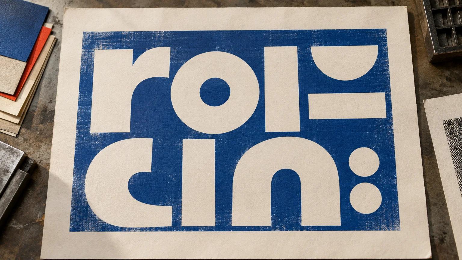
TLDR: Reverse type works best as controlled emphasis: a short headline, label, pull quote, folio, or navigation element set in sturdy, open letterforms against a consistent dark field. It becomes less dependable when the type is small, thin, tightly spaced, printed over a busy image, or knocked out of several inks. Judge it as both typography and print production, then proof it under conditions that resemble the final job.
Reverse type print design creates a visual pause before a reader has processed a single word. A block of color establishes the shape; the light letters interrupt it. That strong figure–ground reversal can lift a section label, make a cover line feel decisive, or divide a page without adding another rule or ornament.
The same effect can undermine reading when used without restraint. White-looking letters on a dark field often demand more from the typeface, spacing, paper, ink coverage, and presswork than dark letters on light paper. The practical question is not whether reverse type is good or bad. It is whether the letterforms and production conditions can preserve the intended hierarchy without sacrificing clarity.
What reverse type means in print
In conventional reverse type, the printer lays down a dark or colored field but leaves the letterforms unprinted. The exposed paper creates the light-looking type. This is also called knockout type or reversed-out type. The color and surface of the paper therefore become part of the letterforms themselves.
That is different from printing opaque white ink on dark or colored stock. White ink is an additional printed material, and its opacity, number of passes, trapping, and interaction with the substrate create a different production problem. A knockout on white paper may look bright because no ink occupies the letters; white ink must physically cover a darker surface.
Reverse type is also unrelated to a reverse-contrast typeface. Reverse contrast describes a type design in which the usual thick-and-thin stroke pattern is inverted. It refers to the construction of the font, not to light type appearing inside a dark printed field.
Why the effect commands attention
A reader normally encounters dark marks as figures against a light ground. Reverse type exchanges those roles. The surrounding field becomes visually substantial, while the letters appear to be cut from it. That interruption is useful for hierarchy because it marks a change in voice, pace, or information level.
A reversed section label can behave like a tab. A short cover line can become a compact shape rather than a loose string of words. A pull quote can interrupt a gray column of body text without relying on a larger size alone. In each case, the color field does organizational work before the wording is read.
But attention is not the same as sustained reading comfort. Miles A. Tinker’s 1963 Legibility of Print includes research on print and background color. In one historical comparison discussed in that work, white type on black was read more slowly than black type on white, while readers preferred the conventional arrangement. The finding is condition-specific and should not be converted into a universal modern percentage or a ban on reversed text. It does support a durable design distinction: an arrangement that is effective for emphasis may not be the best environment for a long passage.
Where reverse type works best
Reverse type is most convincing when its visual importance matches the brevity of its message. It is particularly useful where a reader needs to identify, scan, or navigate rather than settle into continuous reading.
- Mastheads and cover titles, where the color field can establish a strong silhouette
- Section labels, tabs, folios, and short navigation elements
- Short headlines or subheads with generous space around them
- Pull quotes that need to interrupt a dense editorial page
- Brief calls to action, provided the wording remains easy to identify
- Packaging and label information that is prominent, short, and large enough for the production method
Body copy is a more cautious use. A paragraph may look dramatic when viewed as a composition, yet feel tiring once someone tries to read every line. Reversing an entire page also makes small inconsistencies in ink coverage or paper texture more visible. When long reading is the priority, dark text on a quiet, light ground is usually the safer starting point.
Choose letterforms that can survive the knockout
The useful distinction is not simply serif versus sans serif. Either category can work. Look instead at the physical forms that must remain open after printing: counters, apertures, joins, thin strokes, and the spaces between adjacent characters.
Favor sturdy strokes and open interiors
A resilient choice has strokes with enough substance to remain recognizable and counters that do not depend on a hairline opening. Open apertures in letters such as e, c, and s are helpful because modest ink spread around a knockout is less likely to close them. Examine compact forms such as a, e, g, and numerals at final printed size rather than judging only from an enlarged screen view.
Very light weights and high-contrast faces require more caution. Fine serifs or thin transitions may appear elegant on screen but lose definition when surrounded by ink. A slightly sturdier weight often preserves the typeface’s character better than simply enlarging a fragile cut.
Give letters and lines room
Tight tracking can cause neighboring letters to merge visually as the surrounding ink encroaches on their spaces. Tight leading can turn several clean lines into a dense luminous texture. Modest additional spacing may improve recognition, but excessive tracking can break words apart. The aim is not a preset number; it is to keep words coherent while protecting their internal openings.
There is no universal safe point size for reversed type. A compact bold sans on smooth coated paper behaves differently from a delicate serif on an absorbent, textured sheet. Viewing distance matters too: a label read in the hand presents a different problem from a poster read across a room. Test the actual typeface at size, on the intended process and paper whenever the text is critical.
Color fields, images, and paper change the result
A consistent, sufficiently dark field gives light letterforms a stable edge. A pale field can weaken the intended reversal, while a photograph or gradient may cause individual letters to move through light and dark areas. The phrase may be legible in one region and disappear in another.
If type must reverse from an image, place it over an area with controlled tonal consistency. A deliberately positioned panel, local darkening, or quieter crop is usually more dependable than hoping every letter falls over favorable detail. Check every line rather than evaluating only the overall composition.
Paper is not a neutral carrier. In a knockout, the sheet supplies the color and texture of the letters. An off-white paper produces warm light type; a gray or colored stock produces correspondingly muted letters unless opaque white ink is added. Texture may roughen fine edges, while absorbency and ink behavior can make small openings less secure. Those effects can be desirable in expressive work, but they should be intentional.
Single-color and multi-color knockouts
A knockout from one solid ink is generally easier to control than a knockout from a multi-ink build. With one ink, the letter boundary depends primarily on that separation, the substrate, and the way the ink prints. With several inks, the components must align closely. Small registration shifts can produce colored fringes or uneven edges around the supposedly light letters.
The Flexographic Technical Association’s FIRST 7 Design Guide advises limiting reverse copy to one color where possible. For type reversed from multiple colors, its flexographic guidance calls for an appropriate holding line or choke. These are process-specific recommendations rather than universal settings for offset, digital, letterpress, or other methods, but they illustrate the underlying issue: every additional color separation adds another edge that must align. Read the FTA’s flexographic design guidance
Do not invent a trap or choke value without consulting the printer. The suitable treatment depends on the press, substrate, screening, ink sequence, and the printer’s own workflow. For an unfamiliar method, combine the printer’s specifications with relevant print production technology resources rather than treating a generic software preset as a production standard.
Preflight reverse type before approving the file
A reverse design can look correct in ordinary page view while containing an overprint setting that changes its output. In Adobe InDesign, the default [Black] swatch overprints by default, while most other colored objects knock out. Adobe identifies Overprint Preview and Separations Preview as tools for reviewing this behavior. Adobe’s guide to overprinting in InDesign explains the relevant controls.
Use a deliberate preflight sequence rather than relying on the composite screen image:
- View the layout at its final physical size. Check small counters, punctuation, fine serifs, and narrow gaps.
- Turn on Overprint Preview. Confirm that the background and reversed letters interact as intended.
- Inspect Separations Preview. Toggle individual plates to see whether the letters knock out of the expected inks.
- Confirm that a white object has not accidentally been set to overprint. If it overprints, the expected knockout may not appear as designed.
- Check whether a rich or multi-color background is genuinely necessary. A single-color field may offer a cleaner solution.
- Ask the printer whether the file requires trapping, choking, a holding line, or different type specifications for the chosen process.
- Order or request a representative physical proof when small type, textured stock, critical colors, multiple inks, or unusual white-ink production make the result difficult to predict. For broader proof planning, use this custom print proofing process.
A desktop print can reveal hierarchy, line length, and obvious spacing problems, but it cannot reproduce every press, ink, or paper interaction. A contract proof may predict color more closely yet still fail to simulate substrate texture or the edge behavior of a particular press. Ask what the proof is designed to verify.
A practical reverse type print design checklist
Before sending the job, evaluate the design at three levels: reading, letterform, and production.
- Reading: Is the text short enough for an emphatic treatment? Does the reversal clarify hierarchy rather than decorate every available space?
- Letterform: Are the strokes sturdy, the counters open, and the apertures clear at final size?
- Spacing: Do letters remain distinct without making words feel disconnected? Is the leading comfortable?
- Background: Is the field even enough to support every character? Have gradients and images been checked line by line?
- Paper: Will the exposed sheet provide the intended color and edge quality?
- Color build: Can the type reverse from one ink instead of several?
- File behavior: Do Overprint Preview and Separations Preview show the intended knockout?
- Proofing: Does the proof represent the final process and substrate closely enough for the risk involved?
- Printer communication: Have minimum type, line, trapping, and white-ink requirements been confirmed for this specific job?
Use reverse type as punctuation, not wallpaper
Reverse type succeeds when the visual interruption has a job: mark a section, emphasize a short phrase, establish a cover shape, or create a compact navigational cue. Its strength comes partly from contrast with the rest of the page. If every paragraph is reversed, the interruption becomes the environment and loses much of its hierarchical force.
Start with one short element. Choose open, sturdy letterforms; give them room; place them on a controlled field; and inspect the actual separations. If the piece uses small type, multiple inks, textured paper, or opaque white, involve the printer before the design becomes fixed. The best reverse type feels immediate to the reader precisely because the designer has resolved the difficult production decisions in advance.