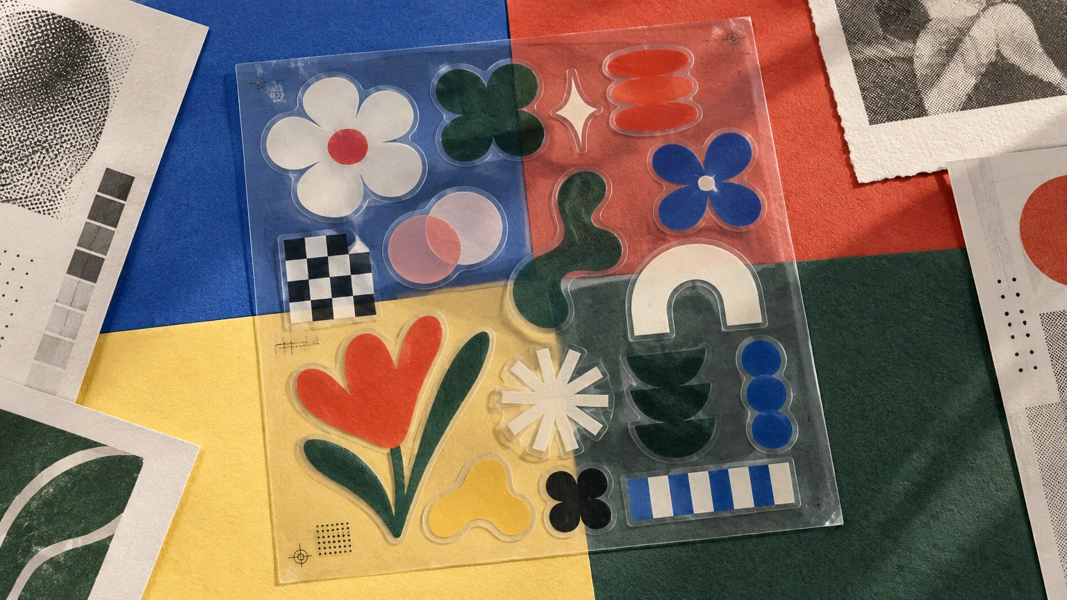
TLDR: Strong aesthetic transparent sticker collections behave like small visual systems. Repeat a limited set of motifs, colors, type styles, line weights, and shapes, but leave enough variation for each sticker to stand alone. Decide which areas should remain clear and which need white underprinting, then preview every design on light, dark, colored, metallic, and glass surfaces. The object underneath is effectively part of the artwork.
A clear sticker is a printed image without the usual white paper field. Its color and shape appear to float on a bottle, notebook, window, case, or metal surface. That quality makes aesthetic transparent sticker collections especially expressive, but it also makes them less predictable: the same pale flower, black letterform, or colored line drawing can change substantially when moved from white paper to smoked glass.
The practical answer is to design or select the collection as an overlay rather than as a set of miniature opaque prints. Cohesion still matters, but so do transparency, underprinting, object color, reflections, and the spaces between printed elements. A good collection anticipates those variables instead of treating clear film as an invisible substitute for white vinyl.
What counts as a transparent sticker?
A physical transparent sticker normally uses a clear adhesive film as its base. Printed areas sit on that film while unprinted areas allow the application surface to remain visible. Transparent printable film is an established graphics material rather than merely a digital effect; for example, Avery Dennison documents a clear promotional vinyl intended for printing, including screen-print applications.
This is different from a digital “sticker” supplied as a PNG with a transparent background. A digital file has no adhesive, film, ink behavior, or physical viewing surface. Its transparent pixels simply reveal whatever the software places behind them.
Related physical terms overlap, so check a seller or printer’s specification rather than relying on a product name alone:
- Clear or transparent sticker: Usually printed on clear film, with some areas left visibly unprinted.
- Translucent sticker: Passes light but may diffuse it, tint it, or obscure detail behind it.
- Decal: A broad term for an applied adhesive graphic; it does not guarantee a clear material or any particular printing method.
- Clear label: Often describes the same basic material concept but places the emphasis on packaging, identification, or product information.
What makes aesthetic transparent sticker collections cohesive?
A collection feels intentional when its members share a visual grammar. They do not need to depict the same object, but they should look as though they belong to the same sentence. Choose two or three strong controls and let the remaining elements vary.
| Design control | How to create continuity | Useful variation |
|---|---|---|
| Motif | Repeat a family such as insects, tools, fruit, stars, or letterforms | Change the pose, crop, species, or scale |
| Palette | Limit the set to a few related hues plus black or white | Let one sticker use an accent color |
| Line | Keep outline weight and drawing texture consistent | Mix dense icons with more open drawings |
| Typography | Use one type family or a tightly related pairing | Vary case, width, size, or short phrases |
| Shape | Repeat arches, circles, clouds, frames, or irregular contours | Include one larger anchor design |
| Clear space | Use comparable open areas around and within the graphics | Shift where the underlying surface enters each image |
Motif alone is rarely enough. Ten unrelated illustrations do not become a coherent set simply because they are all botanical. A tighter botanical collection might use black monoline drawings, one acid-green accent, compact lowercase captions, and transparent gaps inside every leaf. The repeated rules make the set recognizable.
Scale also affects the rhythm. A useful sheet can combine one visual anchor, several medium pieces, and a group of tiny marks or typographic fragments. If every sticker has the same dimensions and density, the set may resemble inventory rather than a composed collection.
Use transparency as an active design element
Clear film is most convincing when the transparent portions have a job. Open areas can form the center of a flower, the lens of a pair of glasses, the negative space inside a letter, or the gaps in a drawn grid. These openings allow the object beneath the sticker to complete the image.
A few systems work particularly well:
- Contour drawings in which the surface provides most of the color field
- Window-like frames that isolate a patch of metal, glass, paper, or plastic
- Typographic compositions with open counters and generous spacing
- Constellations of small marks connected by transparent intervals
- Layered diagrams that appear to annotate the object beneath them
- Illustrations that deliberately incorporate reflections or transmitted light
Avoid making every unoccupied area transparent by default. A clear gap is a positive compositional decision, not leftover space. Tiny isolated marks can become visually weak when separated from a grounding shape, especially on a busy patterned surface.
Why printed color can look faint on clear film
Ordinary color printing often assumes a light substrate. On transparent film, the viewing surface contributes its own color and brightness. Pale ink areas may appear delicate on white, muddy on a dark bottle, tinted on colored plastic, or nearly absent against visual clutter.
White underprinting can make selected colors and text more opaque. In this approach, white is printed beneath some or all of the colored artwork, while intentionally clear regions remain without white. One current commercial description says white is placed beneath the printed portions of its clear stickers to increase opacity while retaining transparent areas. That statement describes the provider’s product rather than a universal setup used by every printer.
The design consequence is significant. White-backed color behaves more like a self-contained printed patch; color without white interacts more strongly with the object beneath it. A collection can use both effects deliberately: opaque illustrated subjects, for example, surrounded by clear line work and open film.
Small white text can also provide contrast, but letter size, stroke weight, viewing distance, and surface color still matter. The same principles behind using reverse type successfully in print apply: fine counters and hairlines are vulnerable when contrast is weak. Ask the printer how spot white is represented in artwork, because layer names, previews, trapping, and production order vary by workflow.
Test every design against real surface colors
A transparent sticker does not have one fixed appearance. It forms a visual pair with whatever receives it. Before producing or purchasing a large collection, preview likely combinations:
- White paper or a pale notebook: Closest to the bright screen preview and generally the easiest context for subtle color.
- Dark plastic or powder-coated metal: Demands stronger contrast or selective white underprinting.
- Colored surfaces: Mix visually with unsupported inks and can alter the collection’s palette.
- Brushed or reflective metal: Adds texture, highlights, and movement to open areas.
- Clear glass: Introduces the view through the object, reflections, interior contents, and backlighting.
- Patterned objects: Reward bold silhouettes and simple lettering rather than fine, low-contrast detail.
For a quick design check, place the artwork over rectangles representing several target colors. Include a photograph or texture sample if the destination is reflective or patterned. This is not a production proof, but it reveals whether a design depends too heavily on a white screen background.
Also inspect the back of an application viewed through glass. Window graphics may require special orientation or ink-layer decisions, and those requirements should be confirmed with the specific printer rather than inferred from a standard sticker preview.
A sticker sheet is a miniature publishing format
A sheet does more than carry multiple adhesives. It frames, sequences, and edits them. Its outer margin is a page edge; the spaces between pieces are gutters; repeated captions create a typographic voice. Even after individual stickers have been removed, the original sheet explains how the collection was meant to be encountered.
Kiss-cut and die-cut formats produce different experiences. A kiss-cut sticker is cut through the face material but remains on a larger backing sheet. That makes the complete arrangement visible and gives the designer control over sequence and spacing. Individual die-cut stickers are cut to their own outer shapes, making them easier to exchange, distribute, or rearrange as independent objects.
For a cohesive sheet, begin with the overall page rather than placing finished icons into leftover spaces. Establish an anchor, clusters, margins, and a reading direction. Rotate pieces only when the movement belongs to the concept; random rotation can make a set feel like production nesting rather than editorial composition.
Transparent stickers as collectible print culture
Stickers occupy an unusual position between publication, label, gift, advertisement, and street graphic. Their adhesive makes circulation visible: a design leaves its backing, enters public or private space, and gains new context from the object carrying it. For broader background, see this history of stickers and adhesive graphics.
Their value as print ephemera is also documented institutionally. The Cornell University Library guide to its Sticker Art Collection describes more than 150 hand-drawn and printed street stickers dated approximately 2008–2011, along with issues of the sticker zine Carnage. The guide notes the research value of unpeeled examples, which preserve qualities that can disappear after exposure and weathering.
A conservation case study published through the American Institute for Conservation also connects the postwar development of bumper stickers with pressure-sensitive adhesives, vinyl, fluorescent inks, and commercial screen printing. The point is not that every contemporary clear sticker descends from one format. It is that sticker aesthetics have always been shaped by material systems: adhesive, substrate, ink, cutting, distribution, and the surfaces on which the graphics appear.
A practical workflow for designing a small collection
- Write one visual premise. “Transparent botanical stickers” is broad; “monoline greenhouse specimens with fluorescent specimen numbers” establishes usable constraints.
- Select a destination family. Choose two or three likely surfaces, such as clear bottles, dark laptop cases, and pale notebooks.
- Define the system. Fix the palette, line weight, type family, shape vocabulary, and approach to clear space.
- Draw an anchor piece. Make one sticker large or detailed enough to establish the collection’s character.
- Build supporting pieces. Create simpler variants, symbols, labels, and small fillers without introducing a new style for each item.
- Map transparency and white. Mark which areas should show the surface, which need white support, and which should remain printed but optically influenced by the background.
- Compose the sheet. Balance scale and density, and leave usable finger space or removal features according to the selected product format.
- Create surface previews. Check white, black, one saturated color, glass, and a textured or reflective context.
- Request a production proof. Verify cut paths, minimum line and type guidance, white-ink setup, orientation, and the treatment of clear regions with the chosen printer.
- Keep a reference copy. Preserve an unused sheet or photograph it flat before separating and applying the pieces.
Home-printable clear media has its own constraints. Cricut, for example, specifies inkjet use for its transparent printable vinyl, but that instruction applies to Cricut’s named material rather than every printable clear film. Match the printer type, cutting process, ink, and material according to the manufacturer’s documentation.
If the collection is moving from mockup to commercial production, compare the printer’s clear-film and white-ink requirements before preparing final files. A relevant next step is exploring custom transparent sticker printing, then checking the current artwork template, proofing method, cut format, quantity, and product specification for the exact option selected.
How to choose an existing collection
When buying rather than designing, view the complete set before judging its strongest individual sticker. Ask whether at least three design rules recur, whether fine elements will survive the intended background, and whether the sizes suit the objects you plan to decorate. Product photographs on white alone are not enough for a collection intended for glass or dark plastic.
Use this short selection checklist:
- The collection has a recognizable motif or visual premise.
- Type and illustration share compatible weight and detail.
- Transparent areas create forms rather than merely removing a white background.
- The listing explains whether printed areas use white backing or remain translucent.
- The size range includes both anchors and smaller supporting pieces.
- Application photographs show surfaces similar to yours.
- The sheet or packaging identifies the artist, publisher, or producer where possible.
Preserve the collection as well as the stickers
If the set matters as an artwork or record, retain its context. Keep an unused example on its original backing when practical, along with packaging or a receipt identifying the artist, date, edition, event, or source. Store unused sheets flat, clean, and away from strong light and heat. Avoid writing directly on the printed face or adhesive backing.
Photograph the complete sheet before using it, then record notable applications. The sheet documents the designer’s original sequence; the applied photograph documents the collaboration between sticker and surface. Together, they preserve both states of an object designed to be separated from its page.
The next step: make the surface part of the collection
Begin with one premise, five to eight designs, and a small set of target surfaces. Create color-background previews before refining every illustration, and decide on transparent and white-backed areas early enough to shape the artwork. The most successful clear-sticker collection is not simply attractive on a white screen. It remains coherent while allowing each bottle, window, notebook, or metal case to become part of the printed image.