TLDR
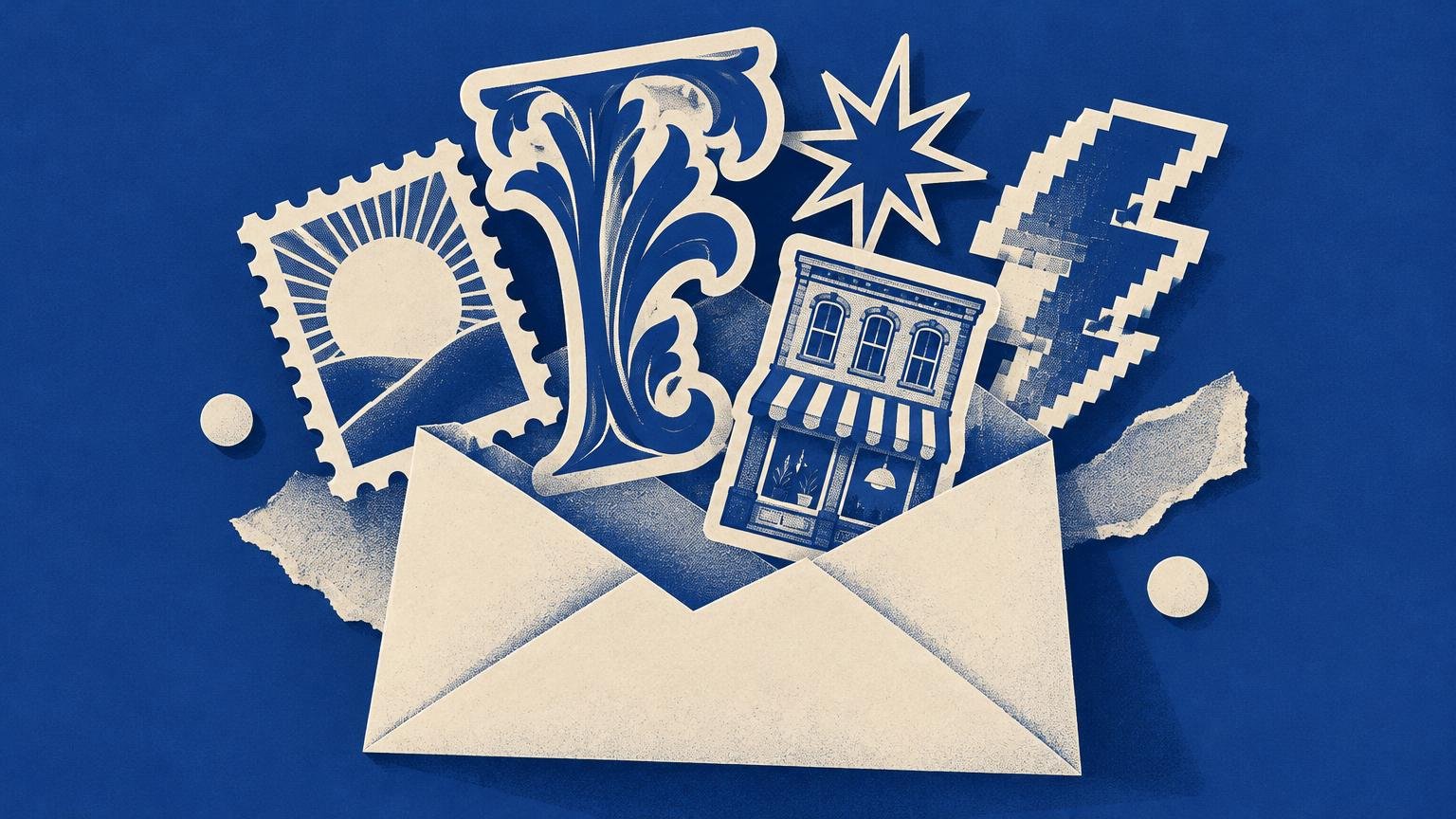
The most useful sticker design trends for online sellers are not isolated motifs but adaptable visual systems: correspondence ephemera, theatrical ornament, tactile shine, deliberate reproduction artifacts, and locally authored imagery. Choose one direction, translate it into a small collection, and make the sticker’s contour, material, typography, and backing part of the design. Treat trend forecasts as creative signals rather than proof that a style will sell.
A sticker is a small printed object that has to work twice: first as an ecommerce image and then as something a buyer can peel, place, collect, or give away. That makes sticker design trends for online sellers unusually dependent on production. A fashionable illustration may attract attention on a screen, but its silhouette, scale, finish, and relationship to the release liner determine whether it becomes a convincing physical object.
Pinterest’s 2026 forecast names directions including Pen Pals, Poetcore, Glitchy Glam, Gimme Gummy, Glamoratti, Neo Deco, and Opera Aesthetic. Adobe’s forecast emphasizes multisensory imagery, surreal experimentation, authentic connection, and local cultural specificity. These are platform forecasts, not sticker sales rankings, but their visible characteristics can still provide useful starting points for a print-aware collection.
Five sticker design directions worth adapting
| Direction | Visible ingredients | Print decision | Main risk |
|---|---|---|---|
| Correspondence ephemera | Stamps, cancellation marks, labels, notes and catalog numbers | Use sheets, edition marks or postage-like contours | Imitating real postal marks too literally |
| Theatrical ornament | Frames, ribbons, centered emblems and expressive display type | Protect small type with a simple hierarchy and generous spacing | Confusing decoration with readability |
| Tactile shine | Gel-like lettering, transparent windows and reflective accents | Assign clear or holographic areas a compositional purpose | Using a special finish as an all-over effect |
| Printed imperfection | Halftones, offsets, overprints and photocopy textures | Build controlled artifacts at final output size | Making intentional distress look like a bad file |
| Authored local imagery | Observed signs, colors, objects and language | Develop a specific collection from firsthand source material | Reducing cultural references to generic ornament |
1. Correspondence becomes a collection system
The correspondence direction is broader than drawing an envelope. Think about the visual grammar of mailed paper: postage-like borders, ruled address fields, handwritten annotations, rubber-stamp circles, inventory numbers, paper labels, and cancellations. These elements already imply travel, exchange, and accumulation, which makes them particularly suitable for collectible stickers.
Turn those references into a system rather than a pile of nostalgic symbols. A six-design collection might share one restrained palette, one display face, and one catalog-number convention. Each sticker can have a different central image while remaining visibly part of the same edition. A kiss-cut sheet can function like a miniature stationery drawer, with a large label, several stamp-sized pieces, and narrow annotation strips.
Avoid copying active postage designs or official marks closely. The goal is to borrow principles—scale, repetition, numbering, frames and evidence of handling—not to make a sticker appear official. A hand-drawn cancellation mark or fictional destination gives the collection its own voice.
2. Ornament and theatrical type return to center stage
Ornamental graphics are useful when they organize information. Frames can establish a boundary, ribbons can hold a secondary phrase, and a centered emblem can turn a short word into a badge. The strongest versions use hierarchy: one expressive display style, one quieter supporting style, and enough open space to keep the whole object readable.
Do not label every geometric border “Art Deco.” Historical styles have specific proportions, materials, lettering traditions, and contexts. If a design merely uses symmetry, metallic color, radiating lines, or a stepped frame, describe those visible features instead. “Theatrical,” “geometric,” or “ornamental” may be more accurate—and more useful to a buyer—than a loose historical label.
Test the design at its printed size, not only as an enlarged artboard. Thin inline letters, tiny counters, and delicate flourishes can become visual noise when reduced. If the phrase matters, print it at 100 percent scale on an ordinary office printer before ordering. Then review the printer’s proof for cut placement, borders, and unexpected cropping; a consistent custom print proofing process is especially valuable when the contour closely follows the lettering.
3. Shine works best when it carries meaning
Gel-like lettering, transparent windows, glossy highlights, and holographic interruptions can make a flat image suggest touch and movement. The important decision is not whether to add shine, but where the shine belongs in the image.
A holographic area might represent water, chrome, stage light, magic, or an electronic glow. Clear film can turn an empty region into a window through which the application surface becomes part of the design. Gloss can isolate a wet-looking letterform against a visually quieter field. These treatments feel more intentional when the material performs a pictorial job.
Clear designs need special planning because the surface underneath will affect their appearance. Light colors may lose contrast, while unprinted transparent areas adopt the color and texture of a laptop, bottle, notebook, or window. For a deeper treatment of white ink, negative space, and surface interaction, see this guide to transparent sticker collection design.
If you are comparing custom sticker formats and materials, ask how white ink, transparency, and reflective effects will be represented in the proof. A compelling mockup cannot substitute for understanding which portions will actually print, remain clear, or reveal a special-effect material.
4. Digital glitches can borrow from print history
A glitch aesthetic does not have to resemble a damaged computer screen. Print offers its own vocabulary of disruption: offset color plates, coarse halftones, overprinted shapes, duplicated edges, photocopy degradation, ink gain, and fragments that appear to have shifted during reproduction.
These artifacts can make a clean digital illustration feel reproduced rather than merely distressed. Try separating an image into two or three color layers, shifting one layer slightly, and allowing overlaps to create a third color. Alternatively, enlarge a halftone until the dots become visible shapes. A photocopy texture can unite otherwise unrelated drawings across a sheet.
Control is what separates a designed artifact from an accidental production problem. Keep important lettering intact, preview textures at final size, and avoid placing simulated misregistration so close to the cut line that it resembles a cutting error. Build one stable element—such as a crisp wordmark or border—against which the disruption can be read.
5. Local and personal imagery beats generic moodboards
Adobe’s forecast highlights authentic connection and local cultural specificity. For a sticker seller, the practical lesson is to begin with observed material rather than a generalized aesthetic category. That could mean hand-painted shop signs, the color combinations of a particular bus route, neighborhood garden plants, regional packaging, family annotations, or the shapes of tools used in a local trade.
Specificity creates details that a generic moodboard cannot: an unexpected abbreviation, a peculiar arrow shape, a familiar color clash, or a phrase with a real social setting. Record where references come from and distinguish your own observations from motifs belonging to living cultural or ceremonial traditions. Permission, collaboration, attribution, or a different source may be appropriate when the material is not yours to freely reinterpret.
A useful test is whether you can explain why each detail belongs. If the answer is only “it looks local” or “it feels folk,” the reference probably needs more research. If you can name the object, place, maker, function, and transformation you made, the design is more likely to have an authored point of view.
Design for the sticker, not just the illustration
The outer contour is one of a sticker’s strongest graphic elements. A good silhouette remains recognizable in a product-grid thumbnail and after the sticker has been placed among other objects. Look at the design as a solid black shape. If every side has similar bumps and no dominant gesture, simplify it or introduce a clearer top, base, point, arch, or directional edge.
At sticker scale, a few disciplined choices do more than extra detail:
- Use one dominant image or phrase rather than giving every element equal emphasis.
- Limit the palette enough that the collection still reads as a family when individual pieces are separated.
- Protect counters, interior spaces, and gaps between letters from filling visually at small sizes.
- Keep critical details away from the expected cut boundary and inspect the proof at actual size.
- Use negative space deliberately, especially when the backing or application surface will show through.
- Repeat one structural device—such as a border, number, corner mark, or type style—across the collection.
Product photography should show both the overall collection and the scale of individual pieces. A close crop communicates texture and print detail; an in-hand or in-use view communicates size. Neither should compensate for a weak silhouette or unreadable type.
Choose the format that supports the idea
A die-cut sticker is cut around the outside contour of the design. A kiss-cut sticker is cut through the sticker layer while leaving the surrounding backing sheet intact. That distinction changes the composition, not just the ordering specification.
Choose an individual die-cut sticker when the silhouette is central, the piece should feel like a standalone emblem, or buyers are likely to select designs one at a time. Choose a kiss-cut sheet when small elements need the protection of a larger backing, several pieces form a scene or toolkit, or labels and decorative fragments make more sense together.
A sheet also creates an extra design surface. Its header, margins, sequence, and printed backing can supply context that disappears after the stickers are removed. This is ideal for correspondence sets, miniature archives, themed collections, and narrative sequences. By contrast, a strong die-cut single should feel complete without explanatory packaging.
Why collectible stickers have such a long visual memory
Stickers are contemporary ecommerce products, but portable adhesive graphics have a substantial history. The National Park Service identifies the earliest known Yellowstone sticker as dating to 1918 and notes Yosemite and Yellowstone windshield stickers in museum collections from 1920. These early examples were souvenirs and signs of travel—small graphics whose meaning grew through placement and circulation. The National Park Service’s account of these “portable posters” shows how contour, lettering, destination, and display surface worked together.
Later bumper-sticker production developed alongside pressure-sensitive adhesives, vinyl, fluorescent inks, and commercial screen printing. Conservation literature describes a pressure-sensitive sticker as a three-layer construction: facestock, adhesive, and release liner. That material structure remains a useful design lesson. The visible image is only one component; adhesion, backing, removal, surface and circulation all influence how the object is experienced.
This history explains why a successful sticker can feel more significant than a miniature illustration. It is a portable sign, a souvenir, a label, a badge and a reproducible image. A buyer completes the composition by deciding where it goes.
Test a trend without rebuilding your shop
Do not convert an entire catalog to match a forecast. Build a limited collection of three to six related designs and define what you are testing: the visual language, the format, the finish, the subject, or the price position. Changing all of those at once makes the result difficult to interpret.
- Select one direction and write down its visible rules in plain language.
- Develop one hero design and two or more supporting designs using the same palette and type hierarchy.
- Print the collection at actual size and remove details that fail at a glance.
- Choose die-cut singles or a kiss-cut sheet according to how the designs relate.
- Order or review an appropriate proof before committing to a larger run.
- Present the collection with consistent photographs and track which designs receive saves, inquiries, repeat orders, or bundle interest.
- Keep the system if customers respond to it; retire or revise individual motifs rather than chasing another forecast immediately.
The practical takeaway
The strongest sticker design trends for online sellers become useful only after they are translated into print decisions. Correspondence references need a collection system. Ornament needs hierarchy. Shine needs a pictorial purpose. Glitches need control. Local imagery needs context and authorship.
Start with one small release and decide what the sticker’s contour, surface, type, and format contribute before adding more illustration. That approach produces something more durable than a copied trend: a collectible printed object with a recognizable visual point of view.
References
- Meet the Pinterest Predicts™ trends
- 21 trends.
- Innovation and authenticity — Adobe’s 2026 Creative Trends forecast | Adobe UK
- Innovation and authenticity — Adobe’s 2026 Creative Trends forecast
- FAQ – CustomStickers.com
- 50 Nifty Finds #18: Portable Posters (U.S. National Park Service)
- 26
The Book and Paper Group Annual 31 (2012)
col