Sometimes the tiniest details do the most work. A raised eyebrow on a cartoon figure. A splash of yellow behind a logo. A curved line where a sharp one used to be. These things might seem small—almost too small to notice—but they shape how we see, feel, and respond.
In product design, this is everything. The little choices add up. They build tone, personality, and clarity. And they decide whether something gets noticed—or ignored.
A Lesson From Little Plastic People
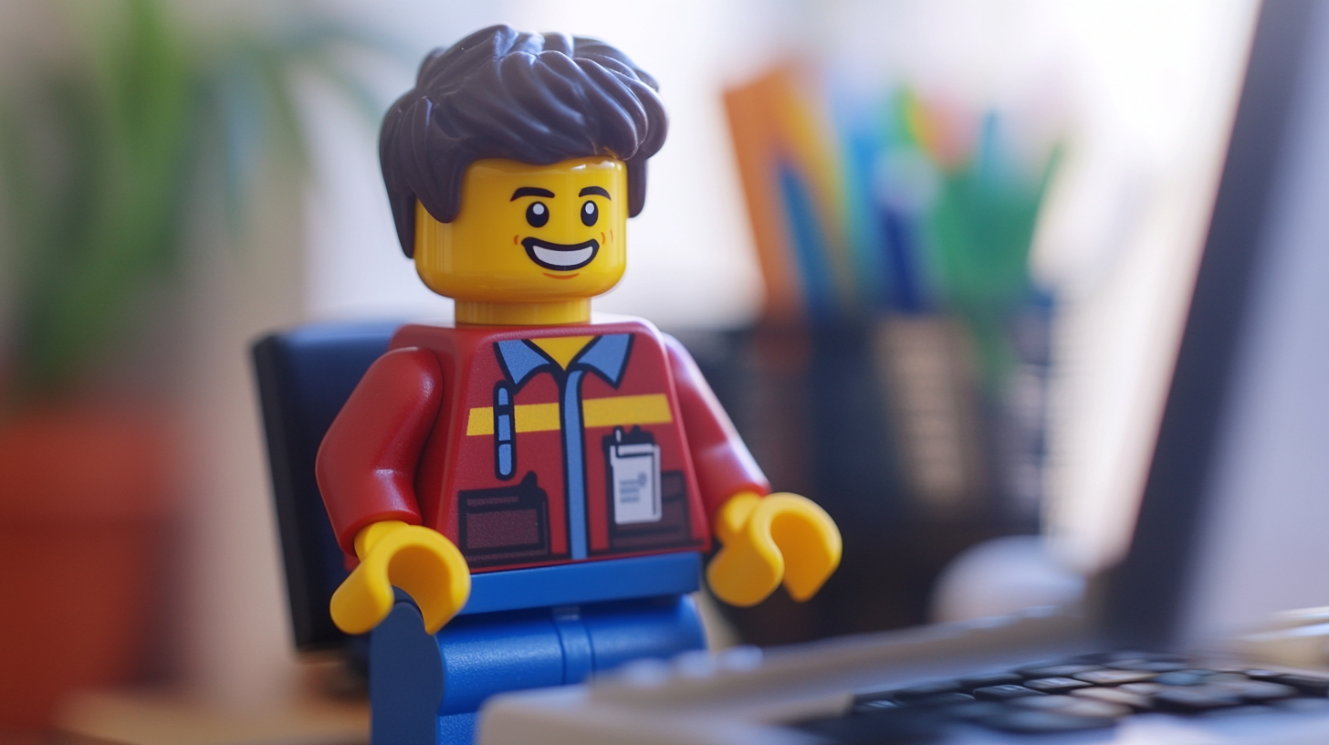
If you want a good example of how much storytelling you can pack into a tiny object, look at minifigs.
They’re about the size of your thumb. But somehow, they carry attitude, style, and story. A pirate minifig with a missing tooth tells a different story than one with a polished grin. A knight holding a flower instead of a sword says something unexpected. Even the way a figure stands—or slouches—shapes how we see it.
These aren’t random. They’re design decisions. And that’s the point.
The same idea applies to packaging, branding, business cards, and every printed piece you put out into the world.
The Power of Facial Expressions
Take a look at two nearly identical minifigs. One is smiling with wide eyes. The other has a half-smirk and one raised eyebrow. Same body. Same clothes. Completely different personalities.
That’s facial expression doing the heavy lifting.
Now think about how that idea translates to print. A friendly typeface. A warm color scheme. A centered layout that feels balanced and approachable. Or on the flip side—a bold color, sharp edges, and intense contrast to feel aggressive or daring.
These are expressions. Not on faces, but on your product. And they’re often what people respond to first, whether they know it or not.
Accessories and Symbolism
Minifigs are packed with accessories. Not just because it’s fun, but because props give quick clues about identity. A minifig holding a quill might be a writer. Add glasses and a book, and now you’ve got a librarian. Swap the book for a shield? Suddenly she’s a scholar-warrior. People fill in the gaps.
In product design, you use the same shorthand. A coffee cup on your label tells people it’s cozy. A lightning bolt might say energy. The more clearly your elements speak, the less you have to explain.
This doesn’t mean you clutter your layout with obvious symbols. But the choices you make—fonts, icons, textures—signal things. And when they work together, they create meaning fast.
Posture and Layout
There’s also something physical about posture, even when it’s printed. A minifig leaning forward looks like it’s ready to act. One standing straight up might seem formal or proud. One crouched or turned away might look sneaky or shy.
Translate that into print and you get layout. Where things sit on the page. How they relate to each other. A logo shoved into a corner feels different than one placed dead center with lots of space. Tight spacing can feel urgent. Loose spacing can feel relaxed.
None of this happens by accident. It’s posture. It’s body language on paper.
Why It Matters
People make snap decisions. We all do. And whether it’s a toy, a flyer, or a product box, the details are speaking before the words do.
Think about the last package you opened. Did it feel thoughtful? Generic? Was it easy to read? Did you notice anything odd or clever?
Those impressions stick. And they often come from the little choices. The ones made during the design process that most people never see—but definitely feel.
When you focus on small details, you build trust. You show that you care. And you give your brand or product a voice, even when it’s not speaking.
The Line Between Toy and Tool
It might sound strange to compare branding to toys. But honestly, toys are often better at storytelling. They have to be. A good toy invites imagination with almost no explanation.
Custom minifigs are especially good at this. And if you’re curious, Minifig.biz has a wide range that shows what’s possible when you focus on detail and personality. Some are playful. Some are weird. Some are surprisingly sharp. But all of them show how much expression you can squeeze into a few small pieces.
The lesson for designers and marketers? Think like a toy maker. Make every detail count.
It’s Not About Making It Perfect
Perfection isn’t the goal. Clarity is. Character is. You want your design to reflect who you are, what you stand for, and what kind of experience you’re offering.
It doesn’t have to be loud. It doesn’t have to be expensive. But it does have to make sense. And that happens through the details.
What colors feel right? What textures match the tone? Are you giving your audience room to breathe, or are you crowding the message?
These are small questions. But they shape the whole outcome.
Final Thought
Big ideas don’t always need big designs. Sometimes they need smart, careful, tiny ones. Thoughtful curves. Clear fonts. A posture that invites trust. A layout that feels balanced.
Details aren’t fluff. They’re the way you tell a story when no one is reading.
So next time you’re planning your next print project or redesign, think small. Think about posture. Think about character. And maybe think about minifigs, too.
There’s more truth in them than you’d expect.